How to add Dark Mode styling to your website
Last year, Dark Mode really took off. Many popular apps and operating systems now support a dark mode.
Naturally, web developers really wanted to be able to style web pages to match the system appearance. And browsers vendors did not disappoint: Dark Mode support made its way into modern browsers!
By default, there are no changes with how a website page looks when Dark Mode is activated in the OS. Luckily, out of the box, web pages default to their pristine white background color and black text. If these default colors would be automatically changed upon Dark Mode activation, we would end up with a web compatibility horror story.
The good news is, by using this new CSS feature you can control the way a web page looks in Dark Mode. The prefers-color-scheme CSS media feature lets you do exactly this.
@media (prefers-color-scheme: dark) {
    background: black;
}
@media (prefers-color-scheme: light) {
    background: white;
}
no-preference: The user hasn’t expressed a preferencelight: The user has selected a light themedark: The user has selected a dark theme
If you use a preprocessor like Sass, you can create a handy little mixin to make it even simpler:
@mixin dark-mode {
    @media (prefers-color-scheme: dark) {
        @content;
    }
}

// Usage
body {
    background: white;
    color: black;
    @include dark-mode {
        background: black;
        color: white;
    }
}
As with most shiny and new CSS features, this CSS media feature is not supported in every browser just yet. But, since it won’t break your website in browsers that do not support it (Edge, Internet Explorer), you can use this new feature without a problem.
Emulating prefers-color-scheme in DevTools
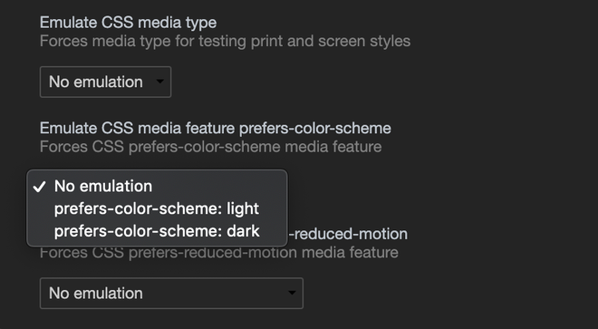
If you want to test your new dark or light mode theme, you can emulate the color scheme with DevTools. In DevTools there’s a nice way to test your website in both color schemes easily, without toggling the system Dark Mode on and off. This toggle wil only affect the currently visible tab.
Within Chrome DevTools you can toggle between both color schemes from the Rendering panel:
- Open DevTools:
control+shift+i(Win/Lin) oroption+⌘+i(Mac) - Open the Command Control:
control+shift+P(Win/Lin) or⌘+shift+p(Mac) - Type “Show rendering”
- Set the Emulate CSS media feature prefers-color-scheme to the value you want to test

Be mindful of your content
Generally speaking you’d like to place images in your content that match the style of the website. When the colors of your website can change, this can be challenging. Not only in terms of look and feel but the readability is something to keep in mind as well.
Therefore, be smart with certain images. Infographics with a transparent background in particular. If you’d like to match the style of these kind of images with the specific color mode the website is in, there are some things you can do to make sure the text is always clear and readable. No matter what the background color behind the image is. To prevent text labels dissapearing into the background of your page, you can simply add a background color behind the labels. Like we did here:

The exact same image on different background colors.