4 reasons to not use a carousel

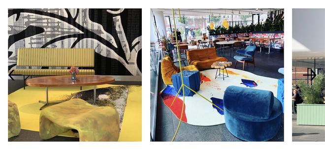
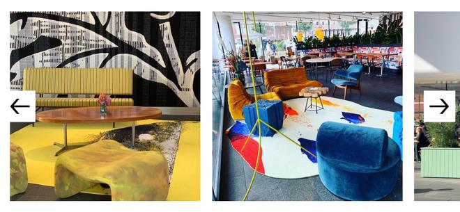
These somewhat sad, sinking horses are an analogy for carousels that hardly anyone clicks through.
At GRRR we’re often critical of the choice for a carousel. Is it really necessary? Does it truly add value? Or could it be that the carousel turns out to be a bad solution that doesn’t fulfill any of the goals that have been set?
What do we mean when we’re talking about a carousel? Maybe the term “slider” or “slideshow” feels more familiar to you. We’re talking about a collection of content, usually a gallery of images, that is divided into multiple steps.
Carousels were quite popular years ago, but are still often utilized. And why wouldn’t they be? They provide an easy solution to show a wide variety of content in a relatively compact manner. Opting for a carousel could mean that difficult conversations about what content should be prioritised, can be avoided.
This may sound ideal, but like I mentioned, we’re not easily convinced that a carousel is the best solution for a certain problem. At first, adding a carousel seems like a cool and fun idea. But you’ll learn there are some serious considerations to be aware of. In this article I would like to go over 4 reasons why it’s better to avoid carousels altogether.
1. Carousels are often ignored
Carousels can be perceived as ads. And that in itself is a problem, because of banner blindness. Banner blindness is a phenomenon in web usability where website visitors consciously or unconsciously ignore information that kinda looks like an ad.
Eye tracking studies show that users often scroll past carousels and that in user assignments the user often fails the task. If a carousel is likely to be ignored, they’re not really helpful, are they? Some users are even annoyed by them.
2. Little engagement
In cases where the carousel didn’t end up being ignored, it’s usually only the first slide that gets noticed. Clickthrough rates get less as slides progress. A lot of research, for example the research of Erik Runyon from the Notre Dame university, underwrites this. At GRRR we also analyzed some of the carousels that we do have, and our statistics show similar results, painfully so.
So, if only the first slide gets all the attention, why bother building the entire thing? Time and money can be spent on something else, something with more value. And as an added bonus: it will probably cut your performance budget some slack as well. But I’ll get to that.
To be fair, there are use cases in which engagement is better. When a carousel is an image gallery (on product detail pages for example), users are more inclined to engage, as this is a known pattern.
Sliders that show content that is regularly updated, like on news websites, see more interaction as well. Engagement is stimulated when it’s clear to the user that there are more slides than just one. So show a hint of the following slides. Make sure the navigation buttons (like “next” or “previous”), are easy to find and that they look like they belong to the carousel.
“A designer considers the carousel as a collection of images, but a user often considers just the one image he sees.” Kara Pernice , Senior VP at Nielsen Norman Group
3. The carousel might introduce accessibility issues
Another reason why carousels can negatively impact your visitors, is one you might not expect: accessibility. Carousels are a source for many accessibility issues.
Some of these issues are caused by poor design decisions, or bad UX choices. But, more often than not, we see that the majority of ‘out of the box’ plugins are not built with accessibility in mind. A lot of these carousels don’t support mouse, keyboard ánd touch input. When they are auto rotating, accessiblity is negatively impacted as well.
The “minimal” carousel slide indicator
A lot of standard carousels use small dots to indicate how many slides the carousel has. This example shows such a slide indicator where color is the only way to determine how many slides there are and which one is active. This is a problem for users having color deficiencies. This fails success criteria 1.4.1 Use of Color of the WCAG2.1

A slide indicator that only uses color to show which slide is active.
There are better options though. Why not create an indicator that uses text to convey this information:

A slide indicator that uses text to show how many slides the carousel has, and which slide is active.
Contrast issues in navigation controls
Another common issue is the visibility of the navigational arrows. Often they are placed on top of the images. When the arrows are dark, and the images are too, there’s hardly any contrast. People who have a color vision deficit can run into issues because of this. This fails success criteria 1.4.3 Contrast (Minimum).

Most of the time you don’t know what images will end up in the carousel. To cater to this, this could be easily solved by placing a solid background color behind the arrows, like:

Auto forwarding carousels
Then there are also carousels that advance or rotate automatically. This unexpected movement can cause accessibility problems:
Content that moves, or automatically updates, can be a hurdle to anyone who has trouble reading stationary text quickly as well as anyone who has trouble tracking moving objects. Screen readers can run into problems as well.
Moving content can also be a distraction for some people, particularly those with attention deficit disorders, who find moving content distracting. The constant moving is making it harder for them to concentrate on other, maybe more important, elements of the page.
For any auto-updating information that starts automatically and is presented in parallel with other content, there should be a mechanism for the user to pause, stop or hide it. If not it will fail success criteria 2.2.2 Pause, Stop, Hide.
4. Impact on performance
When a carousel is included on a webpage, it will need some assets to load and work. Besides that, carousels usually include large images or even videos. For a feature that is often ignored, little engaged with, it can have a big impact on your performance budget. I could argue that sometimes one fantastic, static image is all you need to get your message across. Radical, I know.
Less heavy images mean faster load times and more focus on the elements that actually matter.
If you still want to add that carousel, definitely optimize those assets. Not only will slow loading speed annoy the website visitors, but it will also affect your SEO / page ranking position.
Conclusion
So there you have it. Carousels come at a cost. If you don’t want to actively discriminate your users, avoid them or create a bloody good one.
Or simply spare yourself the trouble, hardly anyone uses them anyway. There are loads of other ways to display images or information. Be creative.
Still feel like you need a carousel? Everyone thinks they are the exception to the rule. But, if you insist, there are some things to keep in mind to make things easier for your visitors:
- No auto rotation/forwarding
- Use good slide indicators (not just dots)
- Optimize those images / videos
- Provide proper navigation controls (inside the carousel region, not beside or below)
- Show a hint of the next slide
💡 Looking for more accessibility tips? Read our article to learn more.